Just-in-case if you are a designer, you do not want to miss this post. Its 'Typography' time. Working with different typefaces gets more complex as you have to be very much careful about the combinations of the fonts. But one thing that I would like to add to that is it is one of the main building blocks of the designing. So this post is like just a big picture of what you would see in any of the typography courses. So lets begin.
So, whenever you enter in the field of typography you have a lot of anatomy to learn or even you might come across some of the most geekiest terms that you might have ever heard associated with the fonts. Here are a few of them that I would like to mention:
> Baseline: all lower case letters rest on say ‘c’
> Descended line: lowest point of a character say ‘y’
> X-height: height of the lower case letter ‘x’
> Cap height: top of the capital letter. ‘T’
> Ascender height: maximum height ‘h’
> Baseline: all lower case letters rest on say ‘c’
> Descended line: lowest point of a character say ‘y’
> X-height: height of the lower case letter ‘x’
> Cap height: top of the capital letter. ‘T’
> Ascender height: maximum height ‘h’

Figure 1: Showing all all different terminologies used in typography.
Some typefaces have 'serifs'. Just look at the bottom part of 'p' character in the next figure.

Figure 2: 'serifs' in character 'p' and other GEEKY terms related to font

Figure 3: Some of the special terms in the character 'g'
The circular closed face shown in the counter is known as 'counter'. Just a quick knowledge based question:
Q: What is the 'dot' on the top of 'i' called?A: Tiddle.
Now I would just like to make a difference pointed out here. You all might have heard about 'typefaces' or 'font' but actually both of them are different. Here is how:

Typeface is a peculiar design while font is a peculiar font within that design. Minion/Myriad are typefaces. When you see Minion Bold its a font in Minion Typeface. There are 1000s of typefaces that are spread around and which are basis for again 100s of 1000s of fonts.
Again, if you have heard about: Serif and San Serif, both are different again. Serifs are with 'twirls' and San Serifs are with 'no twirls'.
Also, looking at the measurement system, 'Points' vs 'Picas' are different too.

Figure 5: Difference between the 'typeface' and 'font'
The 'Points'(seen in Word, Adobe InDesign) were used when in early years when printing was done by using metallic mold of the characters(what height you want to have to handle the character). Hence 200 point(pt) of one font may not be equal to 200 point(pt) of other font.

Figure 6: Notice the difference in size as both fonts are in 200 pt

Figure 7: Carved Letters

Figure 8: Counter of 'g' is larger
Now here comes some of the mathematical terms about the fonts and their sizes:> Cap height of 100 pt font: 70% of pt(other fonts may be +-10%)
> X-Cap = X height = 70% of cap height
Say we want to use myriad and minion fonts together as the headlines and as the body text. Hence, in-order to avoid the difference we reduce/increase the size of the fonts till the X height matches.
Here are a few terms that would help you in the paragraph level formatting:
> Kerning: space between 2 characters, tighter looser…(serifs and headlines)
> Tracking: space in range of characters. (Body Text)
> Word Spacing: Word spacing should be done properly.
> Leading: Space between lines
> Kerning: space between 2 characters, tighter looser…(serifs and headlines)
> Tracking: space in range of characters. (Body Text)
> Word Spacing: Word spacing should be done properly.
> Leading: Space between lines

Figure 9: Different formatting/spacing terms
Every font has these characteristics. Hence it is advisable to use them wisely and carefully before you end up in an entangled manner.
Ok! so swaying just a bit away from these geeky technical terms, you might be wondering why there are some fonts that we have to pay for?!! Well, it actually goes like this: The font characters need to have proper spacing. Hence current pairs(mathematical spaces) between 2 characters is decided at different sizes of the font and this is a painful task. #Sad. Hence these fonts are paid and they have these inbuilt pre-defined characteristics of paragraph level formating. Hence, whenever you are buying a font you are buying yourself time against the painful alignment task.
Now, all the default font settings have 'Metrics' spacing. Just for the example, look at the image below:
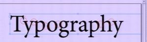
Figure 10: 'Metrics' Character level spacing
Just as you can see, whenever I place my font over the background of the colour or text there is some unwanted gaps between the characters.
> 'Ty': too far…
> 'yp': too close
> 'po': too far
> 'og': too far
> 'phy': far
So, just as when you set your spacing options to 'Optical' *(Only for InDesign Users) what the Adobe Type Engine does is it compares the background with the text and then tries to optimize the inter-character spacing so as the effect of the background colour does not overshadow the text that has to be read.

Figure 11: 'Metrics'(Top Typo) vs 'Optics'(bottom Typo)
And above all, when you have a huge amount of text on the paste board, it does not take processing hit.
For script type faces: Metrics(default)(hand written) don’t make it optical(breaks).

Figure 12: Bad effect of 'Optics' on the hand written font
Lastly, the leading size must be kept at +2 or +3 the size of the font. This enhances the readability of the article as it emphasizes the font. Also, you can use the optical margin alignments to remove the non-hanging quote marks.

Figure 13: Hanging Quote marks